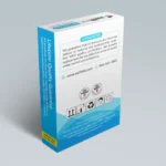
SwiftInk — Ink Cartridge Packaging Redesign
A complete packaging redesign for SwiftInk, a US-based ink cartridge manufacturer selling remanufactured printer cartridges online. The project required creating a professional, retail-ready box design system that would work across six different product sizes while maintaining brand consistency with swiftink.com. The design needed to balance multiple regulatory requirements (warranty disclaimers, ISO 9001 certifications, legal text), marketing messaging (“Lifetime Guarantee,” “Premium Quality”), and practical considerations (sticker areas for model numbers, hanging flaps for retail display). This project marked the beginning of a 7+ year client relationship and earned me one of the most exceptional testimonials of my career.
Project Overview:
Project Type:
Product packaging system (6 box size variations)
Initial Scope:
Contest entry for single box design concept
Expanded Scope:
Upon winning, developed complete packaging system across six different box dimensions
Box Specifications:
Non-hanging sizes:
Retail hanging sizes (with 35mm hanging flaps):
Challenge:
Create packaging that:
Design Direction:
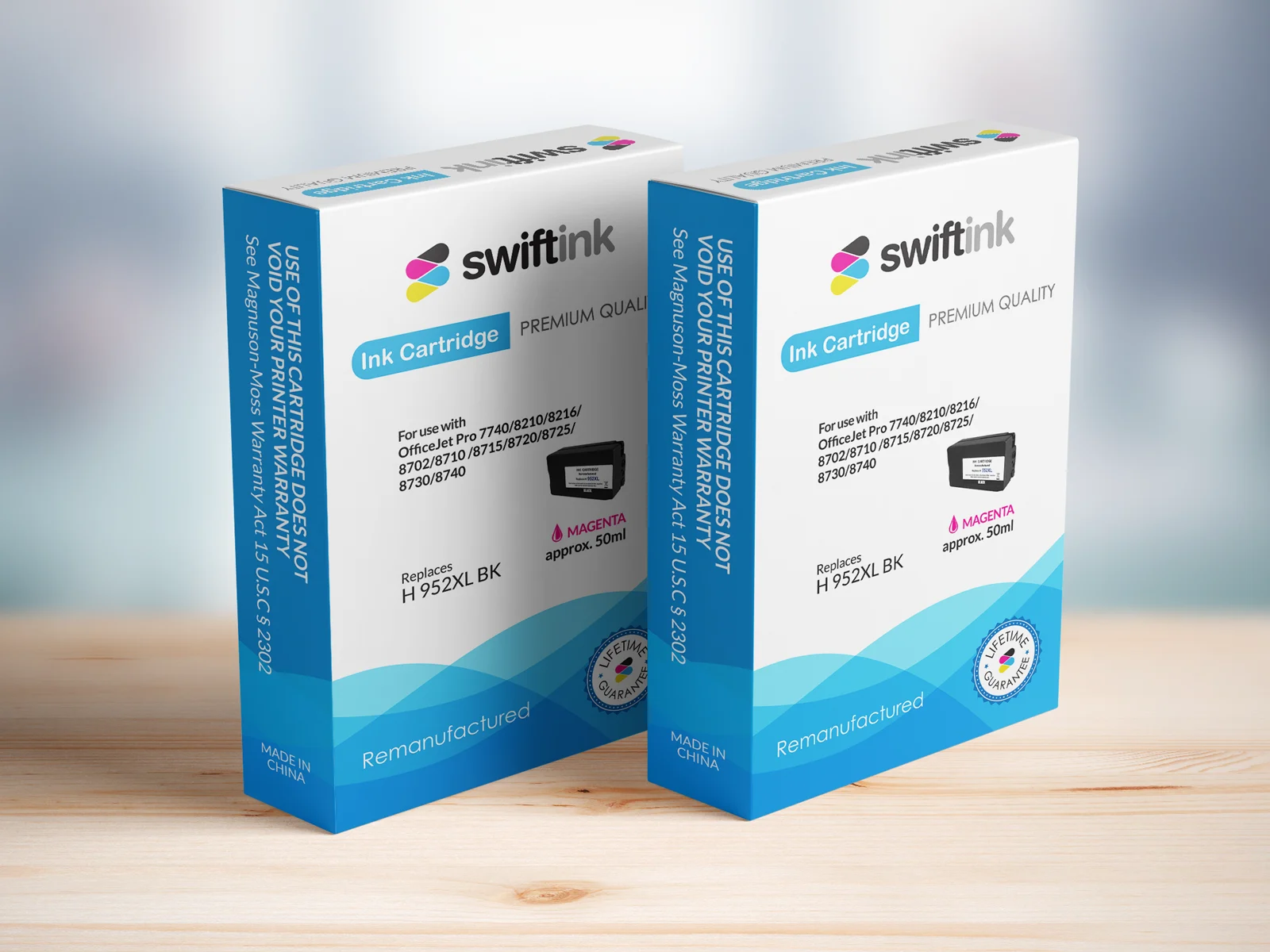
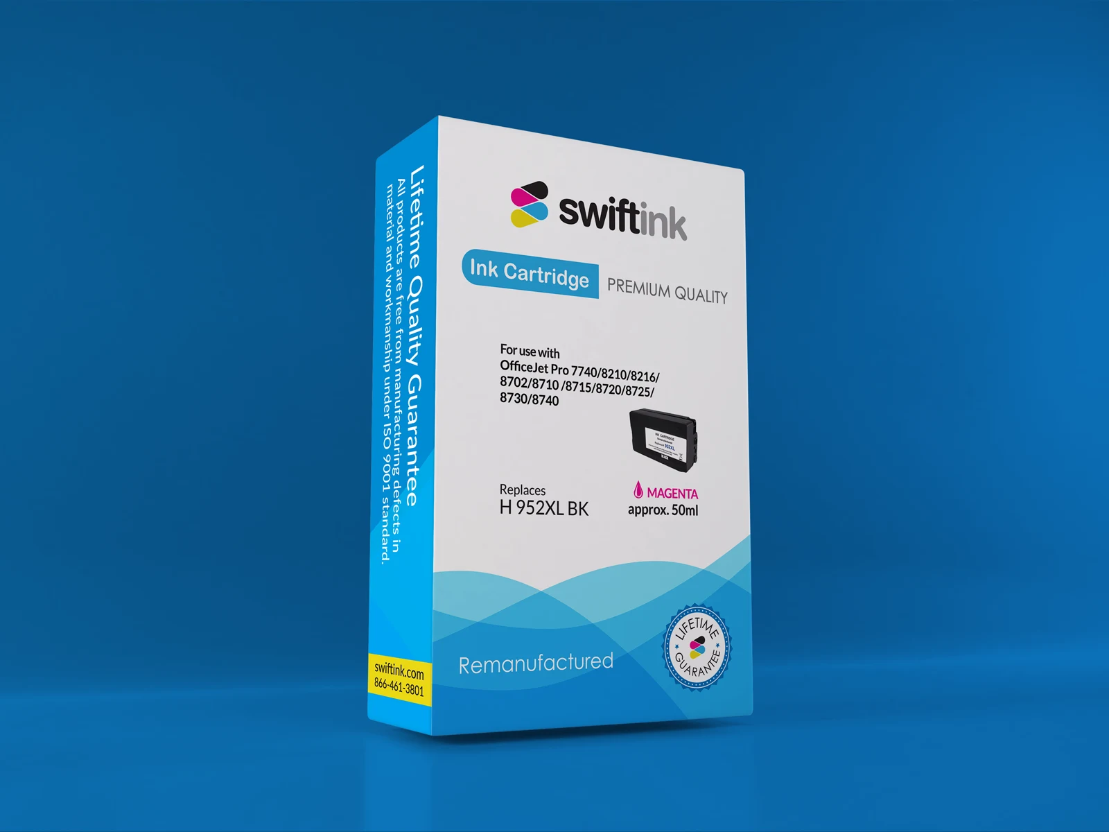
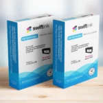
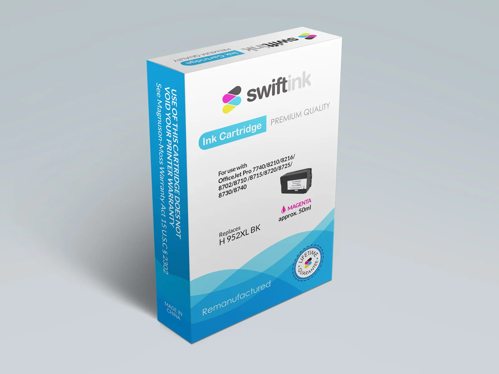
Clean, professional layout with white background (industry standard for ink cartridges). Colorful accent elements drawing from SwiftInk’s web brand palette. Modern typography with clear information hierarchy. Strategic use of seals, badges, and trust indicators to position remanufactured cartridges as premium quality alternatives.
Front Panel Elements:
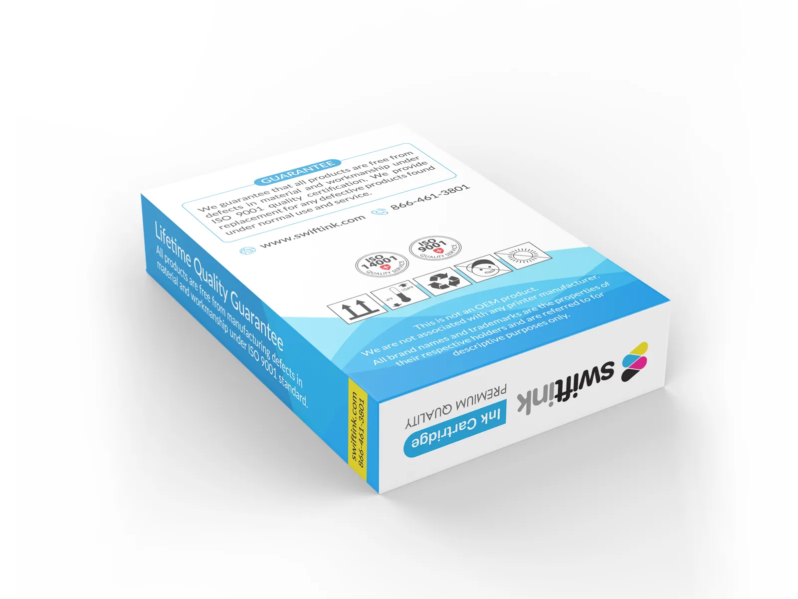
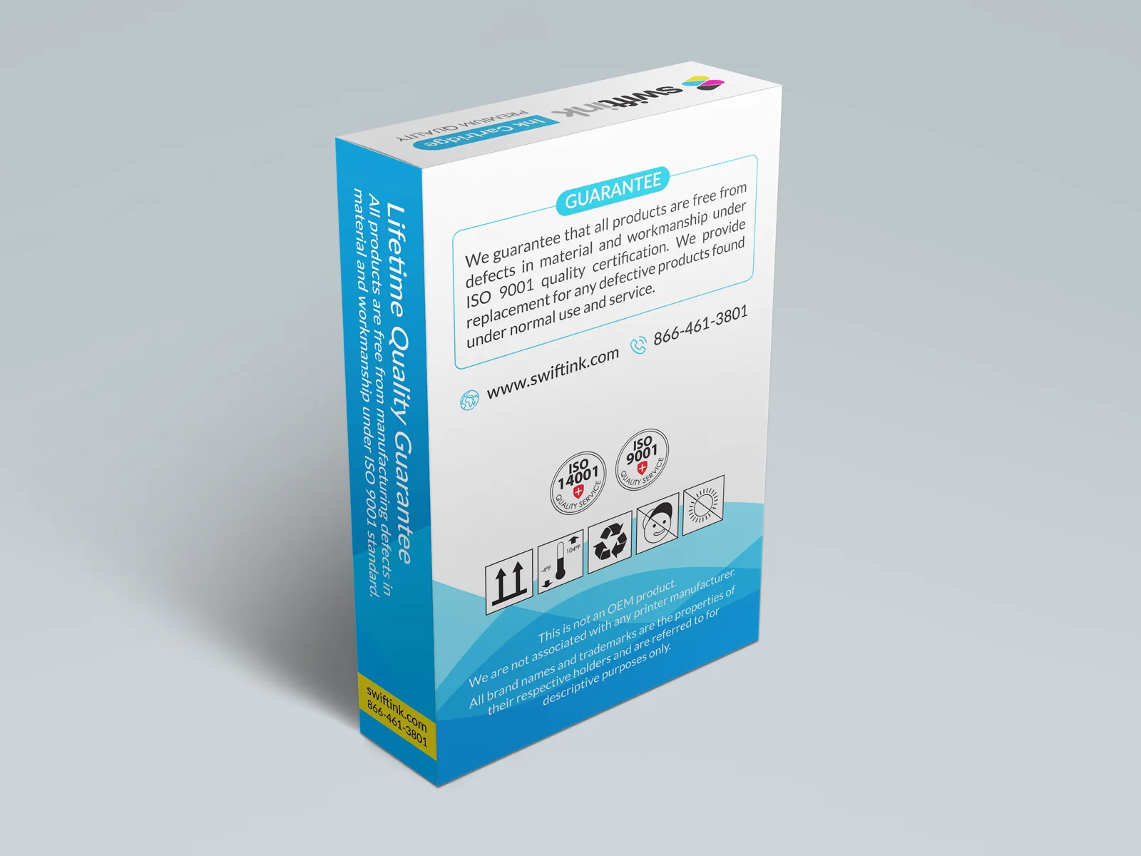
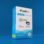
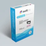
Side Panel 1 Elements:
Side Panel 2 Elements:
Solution:
Deliverables:
Result:
The client’s testimonial speaks volumes: “In more than 10 years on Freelancer, this is the best designer I have ever hired. He’s incredible.” This project established a long-term client relationship spanning 7+ years, with multiple subsequent projects including marketing materials, website graphics, and product photography editing.
What The Client Said
“In more than 10 years on Freelancer, this is the best designer I have ever hired. He’s incredible.”
— Liguid S. (@Liguidsoul), SwiftInk (United States)
Design Challenges Solved
Challenge 1: Six Wildly Different Box Proportions
The box sizes ranged from tall/narrow (70 x 20 x 110 mm) to short/wide (90 x 18 x 70 mm). Creating a design that looked professional and balanced across all six required a flexible, modular approach rather than a rigid template.
Strategy:
Challenge 2: Regulatory vs. Marketing Balance
Ink cartridge packaging has strict legal requirements (warranty disclaimers, certification standards, country of origin, etc.) that compete for space with marketing messages (“Premium Quality,” “Lifetime Guarantee”).
Solution: Front panel focused on marketing appeal and brand trust, side panels housed regulatory text in professional, readable formats that didn’t detract from overall aesthetic.
Challenge 3: Competing with Established Brands
The client provided competitor packaging as reference. SwiftInk needed to match the professional appearance of major brands (HP, Canon, Epson) while clearly positioning as remanufactured (not counterfeit).
Approach:
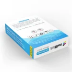
Challenge 4: The Sticker Area Dilemma
SwiftInk uses the same boxes for dozens of cartridge models, adding model-specific stickers post-printing. The sticker area needed to be:
Solution: Designed a bordered frame with subtle gradient background and “Model/Color” label, making the sticker placement area both functional and aesthetically integrated.
Challenge 5: Hanging Flap Integration
Three of the six boxes included retail hanging flaps. The designs needed to work both with and without these flaps while maintaining visual consistency.
Execution: Ensured critical branding elements (logo, primary messaging) were positioned below flap fold lines. Used flap space for secondary information that enhanced but wasn’t essential to the design.
Why This Became a 7-Year Relationship
Quality Beyond Expectations
The client had worked with designers for over 10 years. Setting a new standard earned long-term trust.
Attention to Practical Details
Understanding die-cut printing, hanging flap mechanics, sticker application workflows, and retail display requirements showed professional expertise beyond pure design.
Flexibility Across Projects
After packaging, the client returned for marketing materials, website graphics, promotional designs — proving the value of consistent quality.
Communication & Reliability
Meeting deadlines, responding quickly, and going “out of the way” (as multiple clients noted) builds relationships that last years.
Project Gallery