Affiliate Marketing Guide — eBook Design & eCover Creation
A professionally designed PDF guide created as a lead magnet for an affiliate marketing sales funnel. The client, Jerry, had written comprehensive content in a Google Doc but needed it transformed into a visually appealing, conversion-optimized digital product. The project required converting raw text into a structured eBook with professional layout, typography, graphics, and visual hierarchy — plus creating a 3D eCover and promotional mockup for use in the sales funnel. The final product needed to establish credibility, engage readers, and drive conversions for the affiliate course promotion.
Project Overview:
Project Type:
Lead magnet eBook design with 3D eCover and mockup
Challenge:
Transform a text-heavy Google Doc into a professional digital product that:
Client Context:
Jerry was building a complete sales funnel to promote an affiliate marketing course/platform. The PDF guide would be the first touchpoint — the “free value” that converted website visitors into email subscribers. First impressions mattered enormously: a poorly designed PDF would reduce perceived value of the paid course.
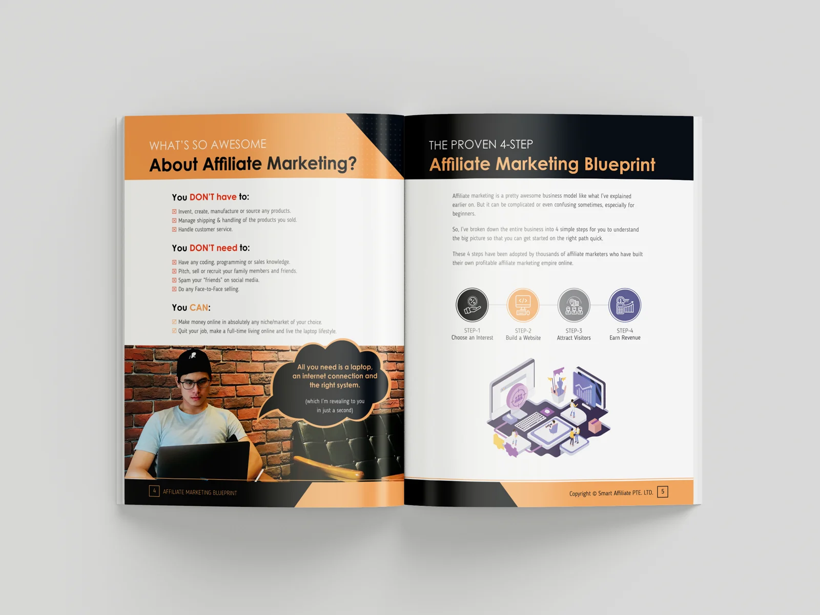
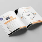
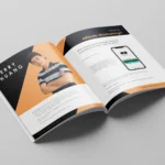
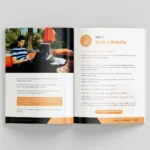
Content Structure:
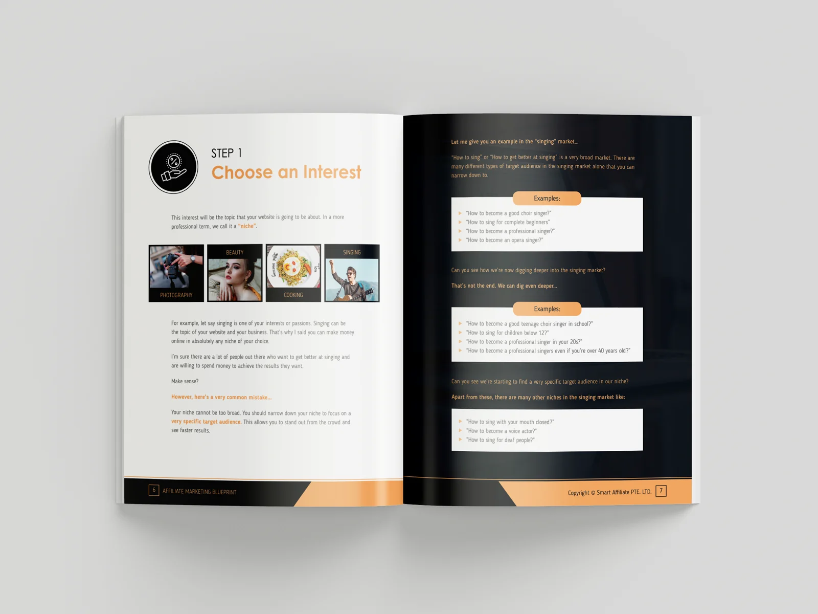
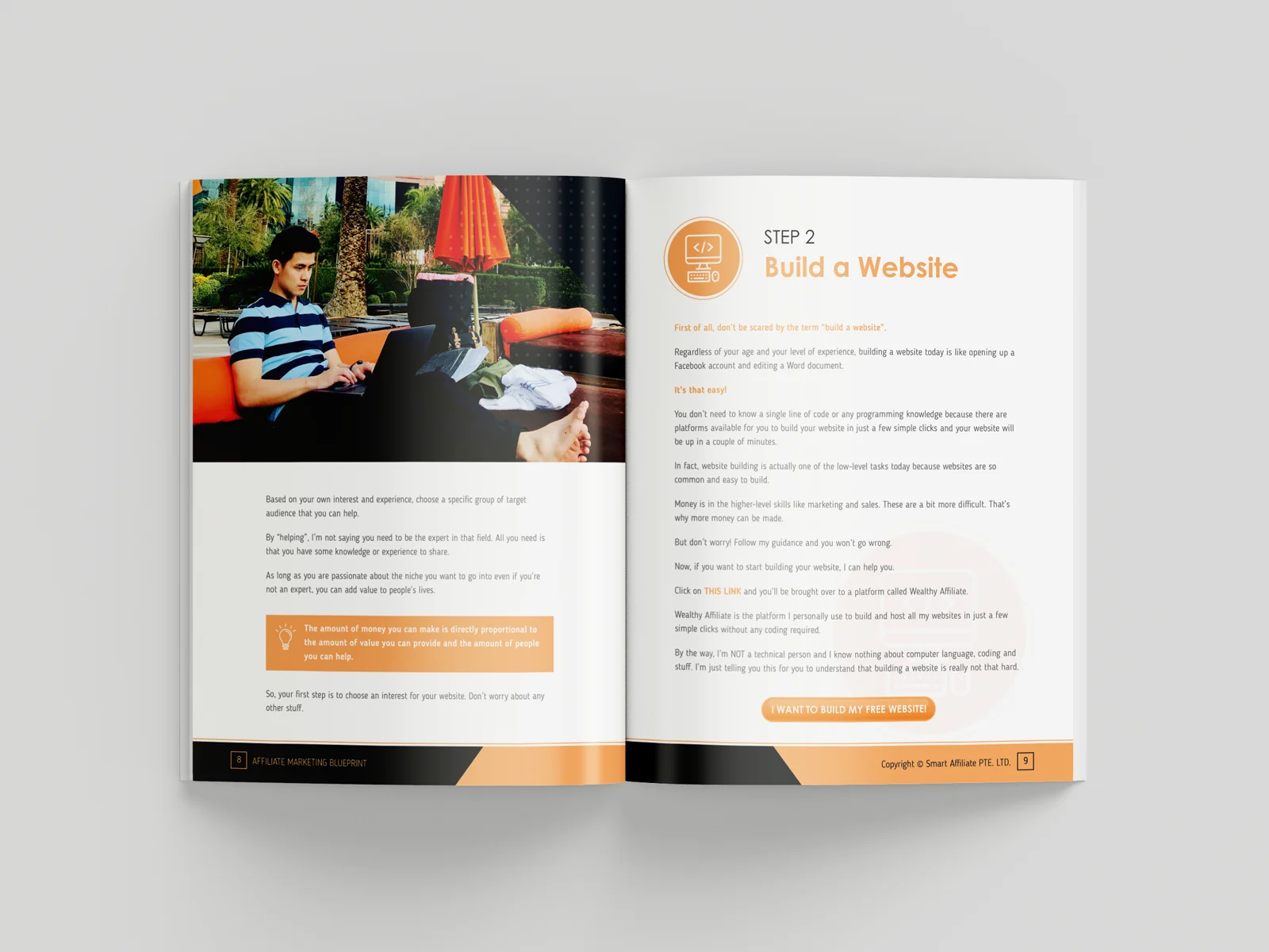
Design Direction:
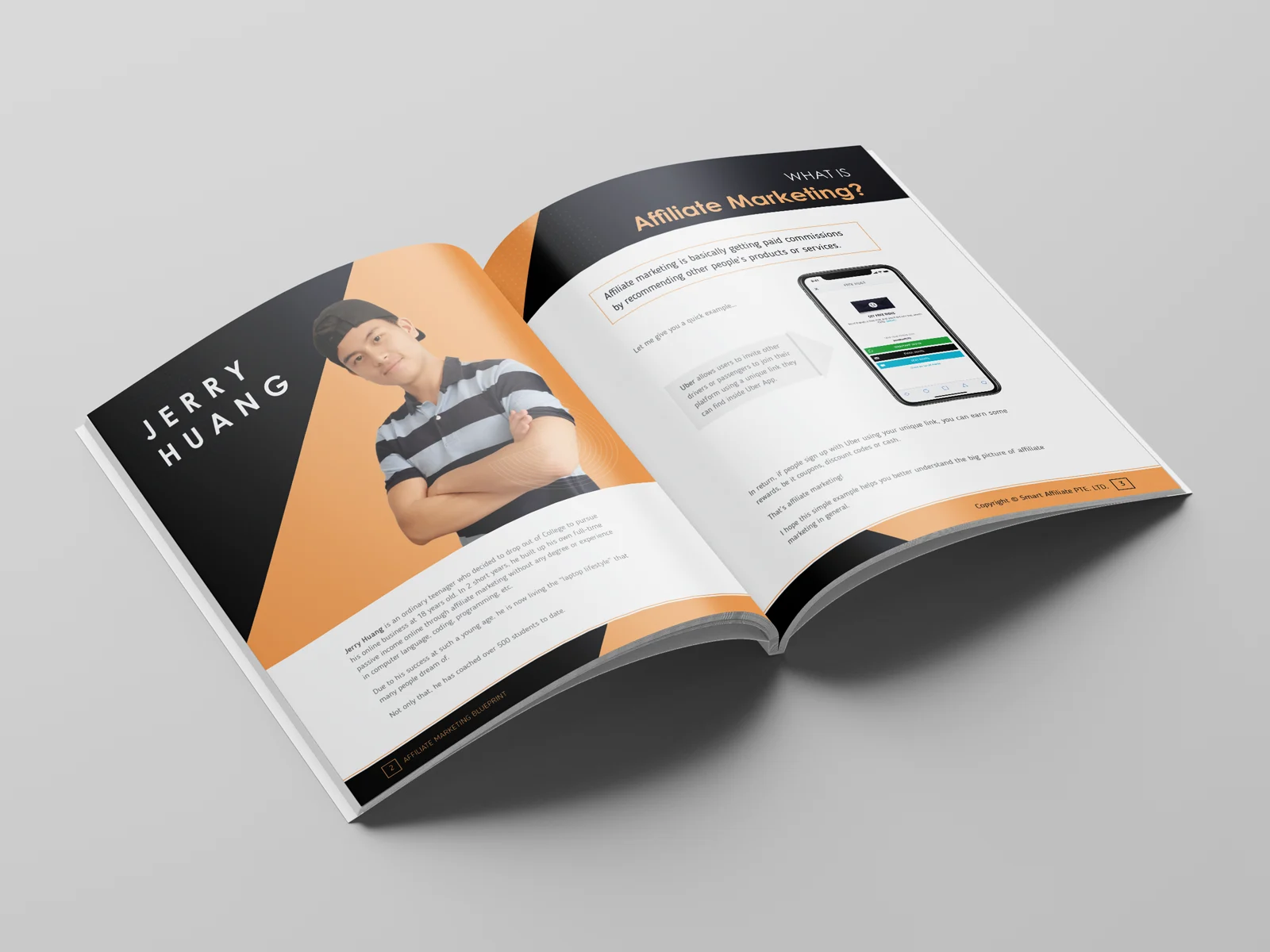
Clean, modern digital marketing aesthetic. Professional but approachable. Used vibrant accent colors to break up text-heavy sections, strategic use of icons and infographics to explain complex concepts visually, and ample white space to prevent overwhelming readers.
Typography Strategy:
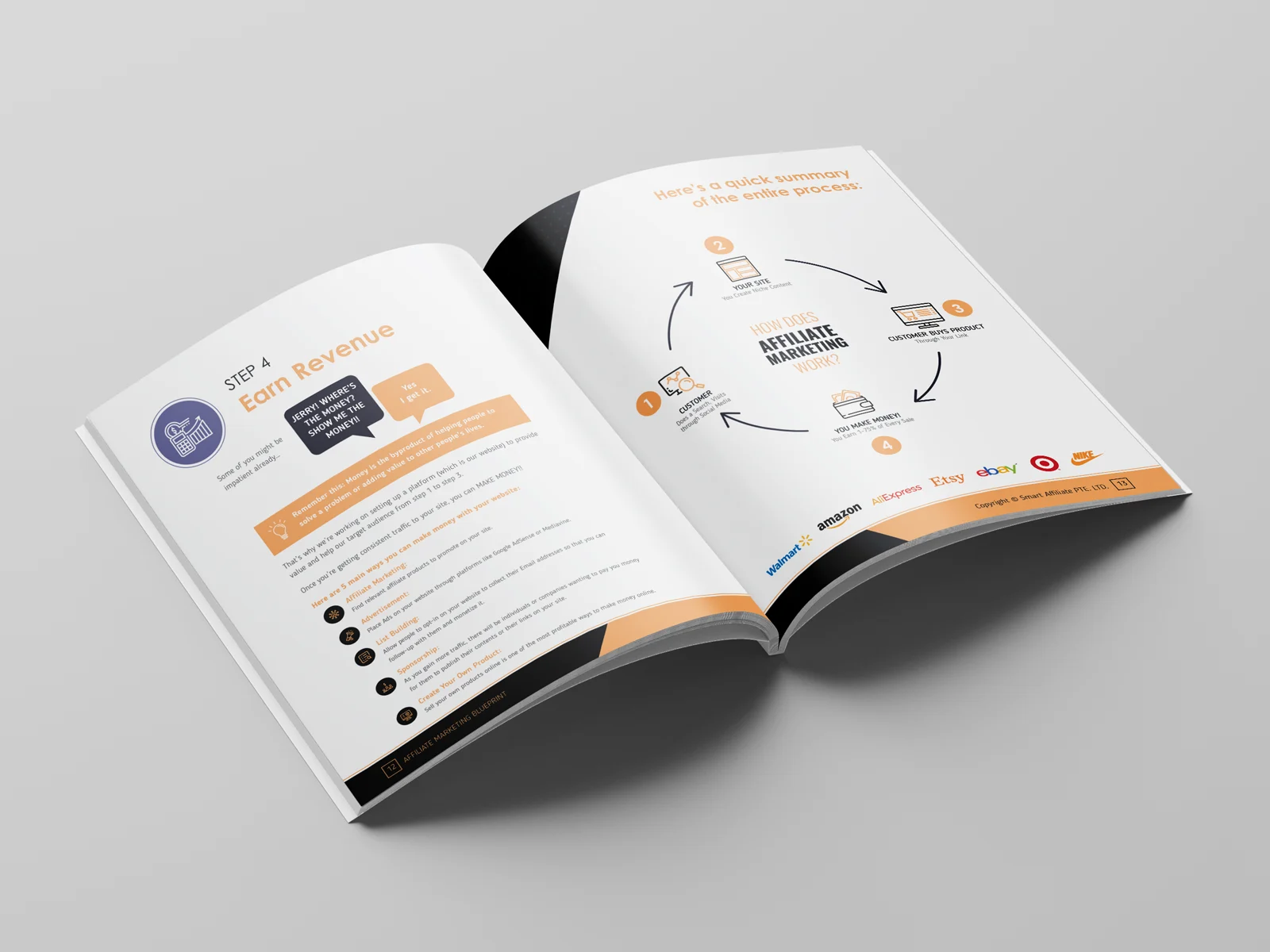
Visual Elements:
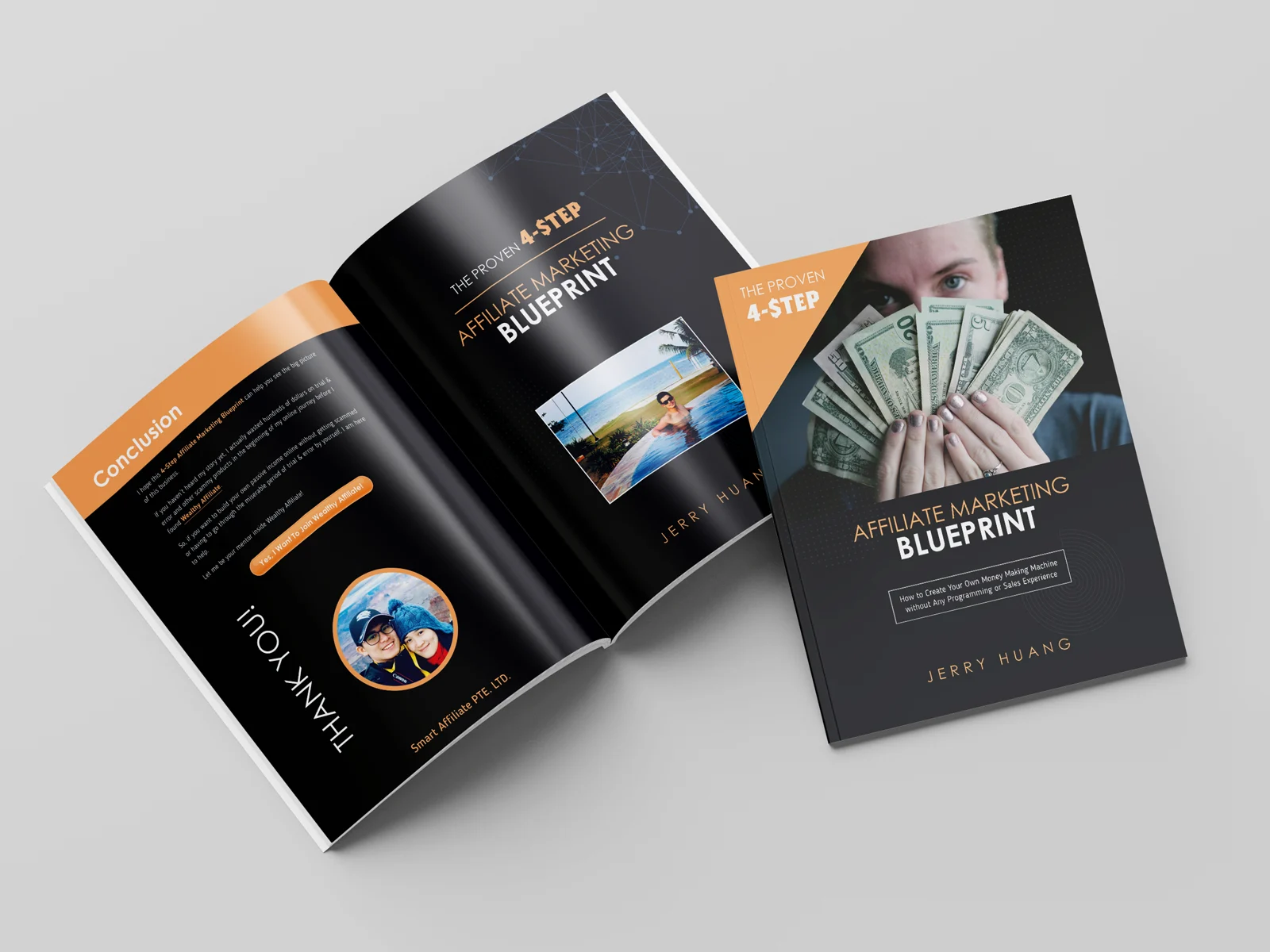
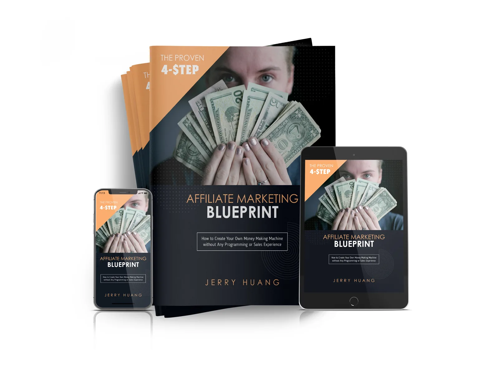
eCover Design:
Mockup Creation:
Solution:
Deliverables:
Result:
Client response: “Faruk is one of the best graphic designers I’ve met (virtually) in my life so far. He responded in a timely manner with really good quality work. Awesome!” The professionally designed guide elevated Jerry’s sales funnel credibility and conversion rates.
What The Client Said
“Faruk is one of the best graphic designers I’ve met (virtually) in my life so far. He responded in a timely manner with really good quality work. Awesome! Thank you Faruk!”
— Jerry Huang (@byjerryhuang), Taoyuan, Taiwan
Design Challenges Solved
Challenge 1: From Text Wall to Visual Guide
The original Google Doc was essentially a long essay — valuable content but visually monotonous. Readers would bounce quickly.
Solution:
Challenge 2: Digital-First Optimization
Unlike print books, PDFs are viewed on screens of all sizes. The design needed to work on:
Approach: Single-column layout, generous font sizes (14-16pt body text), high-contrast color choices, and strategic use of horizontal rules to break sections visually.
Challenge 3: Credibility Through Design
A free PDF guide positions the paid course. If the guide looks amateur, the course looks amateur.
Strategy: Professional typography, consistent branding, high-quality graphics, polished layout — making the “free” guide look like a premium product worth paying for.
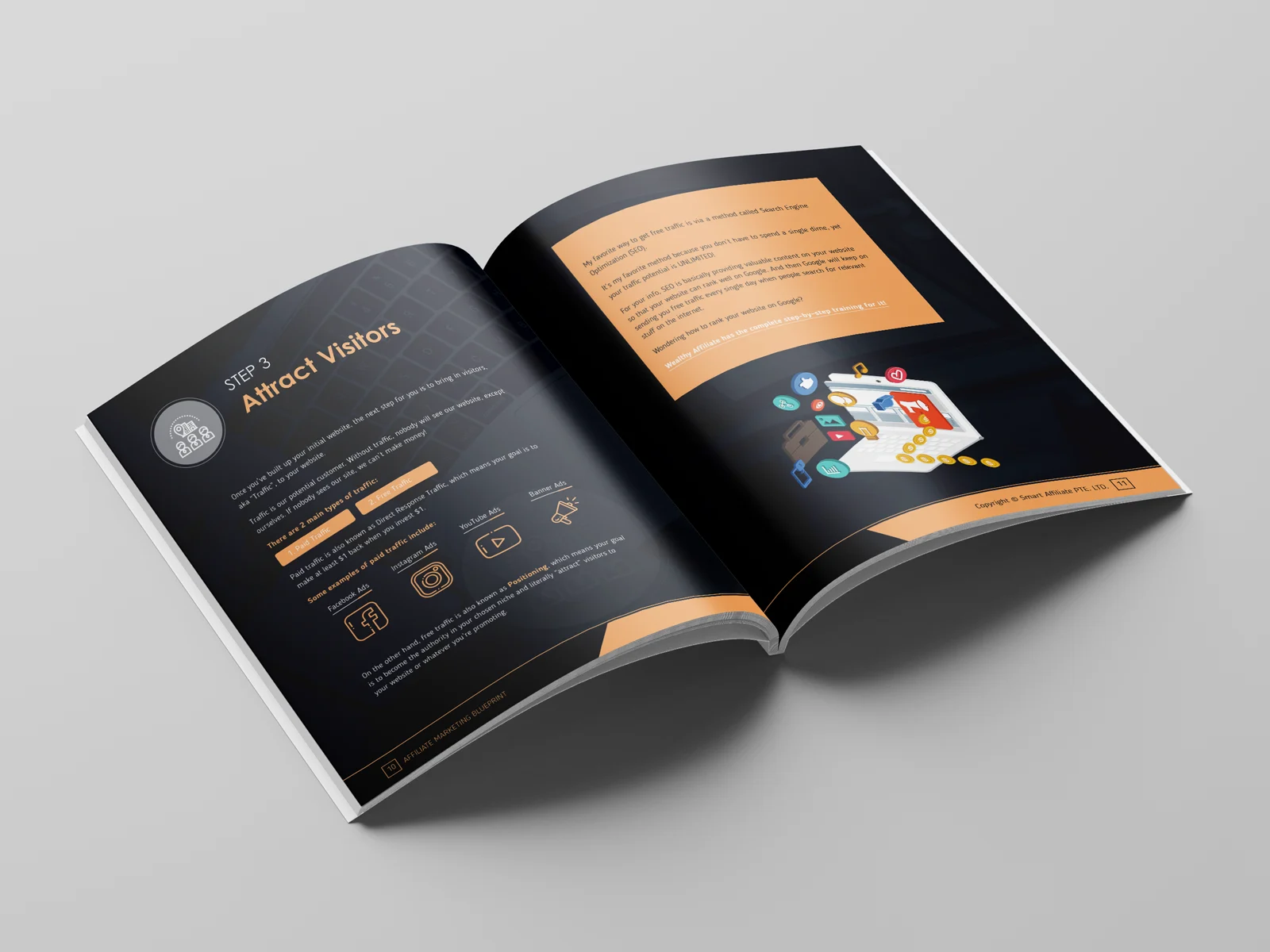
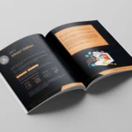
Challenge 4: Screenshot Integration
Affiliate marketing guides require many screenshots (dashboards, analytics, platforms). Raw screenshots look messy.
Solution: Created consistent screenshot frames with drop shadows, added callout annotations, numbered key areas, and sized all screenshots proportionally for visual consistency.
Challenge 5: 3D eCover Realism
The eCover mockup needed to look like a real physical book (even though it’s digital) because human brains associate physical books with authority and value.
Execution: Used professional 3D rendering techniques in Photoshop, added realistic shadows, perspective distortion, subtle texture on the “cover,” and proper lighting to create believable physical presence.
Why eBook Design Matters for Funnels
First Impression = Everything The lead magnet PDF is often the first real interaction prospects have with a brand. A well-designed guide signals professionalism, competence, and attention to detail.
Perceived Value Drives Conversions People judge products by their packaging. A professionally designed PDF makes the paid course seem more valuable by association.
Readability = Engagement If people actually read and enjoy the guide, they’re far more likely to trust the course recommendation and purchase.
Shareability Beautiful designs get shared. An attractive eBook becomes marketing material as satisfied readers forward it to others.
Project Gallery